As a neuroscientist, anesthesiologist and statistician, Emery N. Brown, the Edward Hood Taplin Professor of Medical Engineering and Computational Neuroscience at MIT, has made numerous discoveries about how different anesthetic drugs affect the brain. An important application of his findings, made by analyzing brain rhythms recorded with electroencephalograms (EEGs), is tracking a patient’s level of unconsciousness using EEGs, which can allow anesthesiologists to control drug dosing more precisely. But do those readings occur similarly in all patients? The answer is no. Brown’s research with colleagues at Massachusetts General Hospital, has shown that an individual’s response will vary characteristically with age.
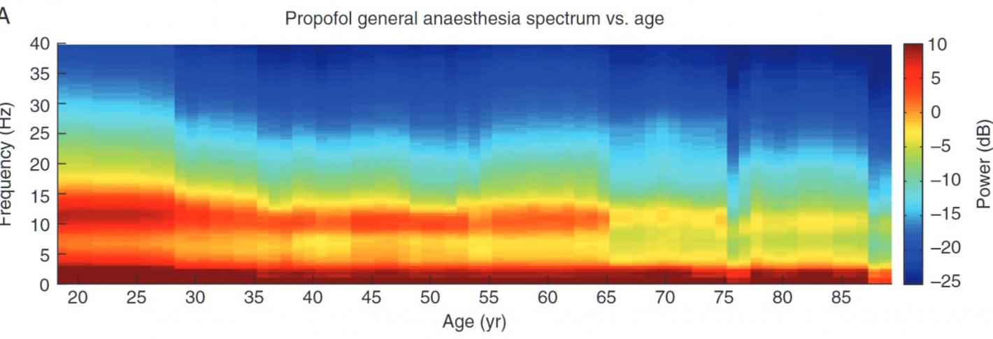
In 2015, for instance, just as Brown was joining the Picower Institute, he co-authored a pair of studies that revealed important age-related differences. One looked at 155 adult patients who received either propofol or sevoflurane. It revealed that the power of rhythms at all frequencies declined with age and declined to different degrees depending on frequency. Coherence in alpha rhythms also differed in older, compared to younger adults. The other study, conducted in rats, showed that older rodents took much longer to emerge from unconsciousness than younger ones given the same doses of the ether anesthetic isofluorane or propofol.
Above: Under general anesthesia, the power of rhythms at all frequencies declines with age .
That same year, Brown also helped to lead a study of EEG patterns in dozens of infants who were undergoing sevoflurane-induced general anesthesia. Indeed, infant brain dynamics differed from that of adults, the research team discovered. They also documented differences between newborns and older infants, finding for instance, that some signature effects of general anesthesia did not become evident until infants reached four months of age. Then in 2017 Brown collaborated on a study of propofol effects in nearly 100 children aged 0 to 21 years. Among the patterns they revealed via their analyses was that total rhythm power evident in EEG measurements was greatest at age 8 and declined with age after that. Also, all children showed similar EEG rhythm patterns after age 1 but infants lacked the coherence in the alpha band that older children exhibited. The clear implication of these studies of children is that developmental stages affect brain dynamics under general anesthesia.

